
When designing an online store, a lot of focus goes on the homepage—it’s the first thing that visitors see when they arrive. But the real goal of any ecommerce website is sales, and there’s no way you’ll achieve that without a stellar product page.
Effective product pages immediately convey the value of the featured product. They show shoppers what the product looks like, tells them what it feels like, and make them believe it’s something they absolutely need to own.
There are so many different features and variations you can choose when building a product page. I’m going to show you some of my favorites, and walk through what makes them so great in the hopes that you can apply these to your next product page design.
Hope you enjoy! And don’t blame me if you find yourself wanting to purchase one or more of these products. That is, after all, the very purpose of an effective product page.

Shopify Academy Course: How to Design Your Online Store
Creative director Stephan Peralta demonstrates how to design a brand people love and an online store even the most casual browsers want to buy from.
Enroll for freeBest product pages: 15 examples
- Luxy Hair
- PooPourri
- Rocky Mountain Soap Company
- United By Blue
- Sixty-Nine
- Leesa
- Manitobah Mukluks
- Perfect Keto
- Johnny Cupcakes
- WP Standard
- Master & Dynamic
- Primal Pit Paste
- Love Hair
- Pilgrim
- Holstee
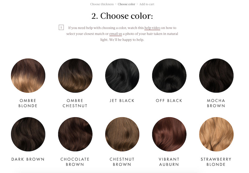
1. Luxy Hair
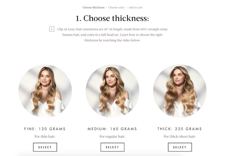
It’s not a stretch to imagine that most Luxy customers are women, as this shop sells human hair extensions. The site immediately welcomes you with a feminine touch, complete with a heart emoji on the tab bar in your browser.
Since this product has many different variants, the user is brought along on a journey toward the one best suited for them, first choosing the thickness of their hair, followed by the color, and then being brought to the specific product page containing (ideally) exactly what they’ve been looking for.
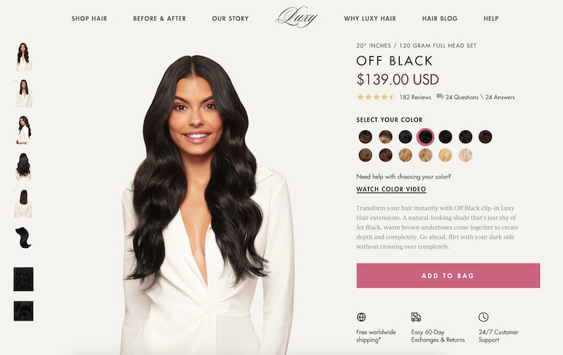
The clear call-to-action here is to add this product to my bag, but if I’m still unsure, there’s a prompt to watch an overview video above the purchase button.
The page also addresses some of the largest abandoned cart indicators: shipping costs and returns. Most data shows the vast majority of shoppers will abandon their cart if shipping is too expensive.
Plus, knowing that Luxy’s customer support team is available around the clock helps me feel assured that I can get in touch should I have an issue or question about my purchase.
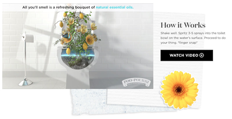
2. PooPourri
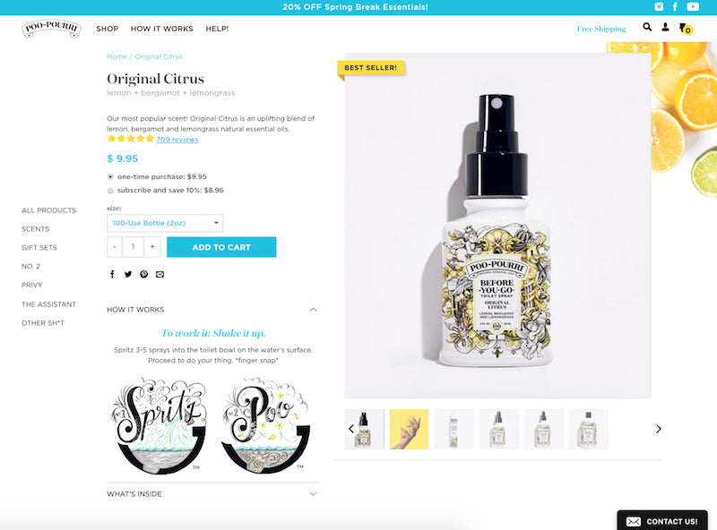
I mean, how can you not get behind a product that speaks so candidly about something so taboo? This product perfectly lends itself to playful copy, which can also be a remarkably good way to gain goodwill.
“Spritz 3-5 sprays into the toilet bowl on the water’s surface,” their product pages reads. “Proceed to do your thing. *finger snap*” (For those who haven’t heard of this product, this is a toilet spray you can use before going #2 that traps odor beneath the water.)
This product page effectively upsells by showing visitors they will save money if they purchase on a subscription basis, and gives the option to purchase every one, two, or three months. They’re also not afraid to make light of their product, as is evidenced with their “How it Works” video.
3. Rocky Mountain Soap Company
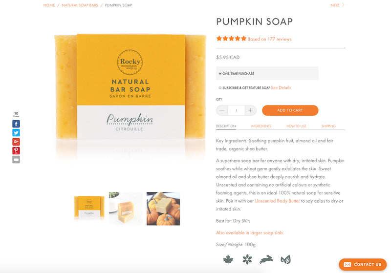
This natural soap company knows that the people looking at their product pages are going to want to know they’re buying high-quality, wholesome products. They state that the product is 100% natural, and lead the product description with a list of its all-natural ingredients. The product menu allows you to view a full listing of ingredients within the product.
What particularly draws me to this product page is its bold usage of testimonials. Below this particular pumpkin bar, one review’s headline reads, “MMMM MMM MOISTURE.” A review that powerfully creates a pretty lasting impression in the mind of someone considering purchasing this product.
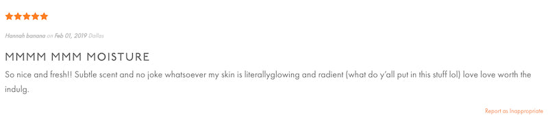
Rocky Mountain Soap clearly knows the power of customer reviews. Nearly a quarter of respondents to a Bizrate Insights survey said they always referenced customer reviews when shopping online, and 40% said they did so often. The social proof immediately below the product, highlighting that it’s been rated with five stars by multiple other satisfied customers, is a sure way to lessen a buyer’s anxiety around never having touched the product in person themselves.
4. United By Blue
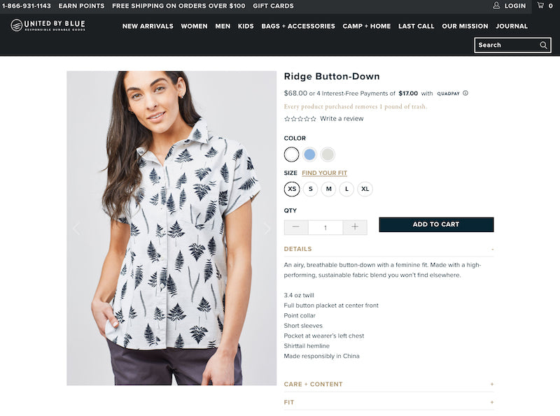
One of the most eco-friendly online stores, United By Blue is on a mission to eliminate trash from the world’s oceans and waterways. You’ll see they reiterate that your purchase helps them get closer to achieving this goal: “Every product purchased removes 1 pound of trash.” Who wouldn’t want to clean up the earth and get a great top out of it?
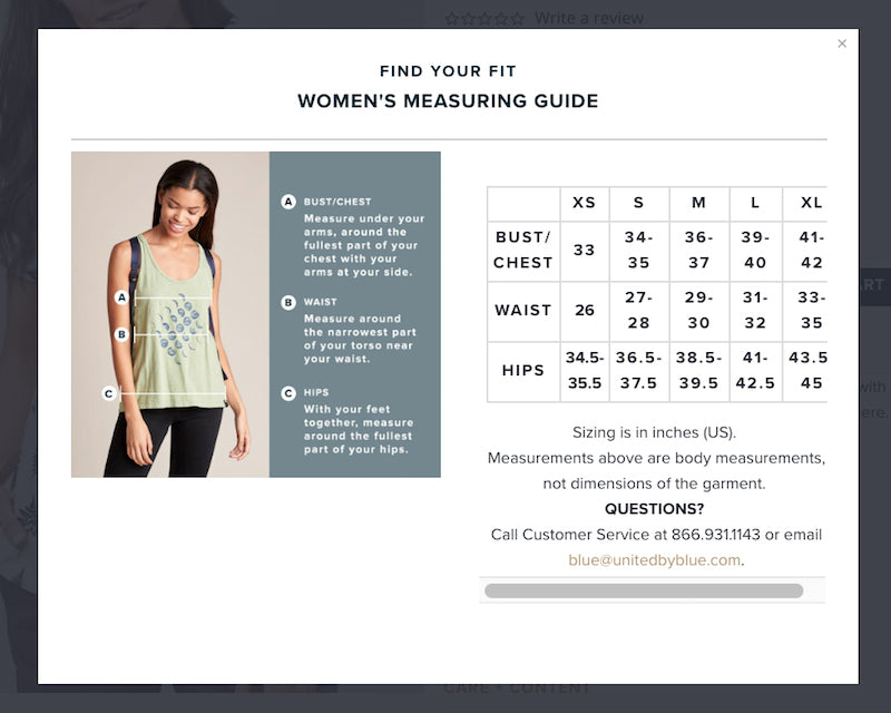
A sizing chart also helps users purchase the product with the right fit, which probably helps reduce the amount of returns the business has to process.

The clean design on each product page takes users through product details, customer reviews, and a collection of similar products. By displaying color variants with the product thumbnails, United By Blue also encourages shoppers to click through and check out the options.
5. Sixty-Nine
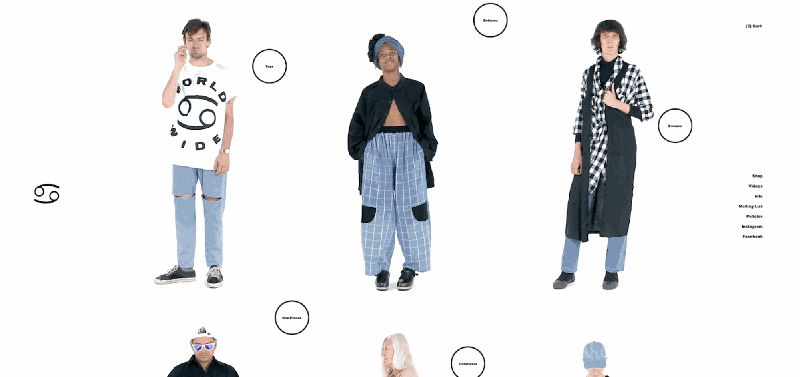
This one doesn’t take much explaining. It’s immediately obvious why this is an attention-capturing product page. The characters moving before your eyes and appearing to look right out at you brings the website and its featured products to life in a highly novel way, unlike many other ecommerce product collection pages.
Once you click through to a specific product, the animation changes to a static photograph, and is accompanied by a clean product page with lots of white space. There’s a link to their sizing chart so customers can be assured they’ll purchase the right fit, and there’s a prompt for me (as a Canadian) to head over to their Canadian store so I can purchase in CAD.
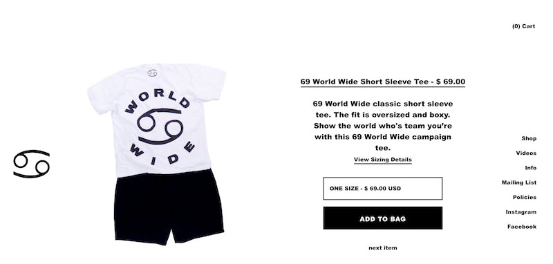
The uncluttered design removes any distraction from the buying experience, giving users a clear and direct path to purchase.
I’ve remembered this website ever since it took home an Honorable Mention in our Ecommerce Design Awards, which we’ve since rebranded and expanded into our Commerce Awards.
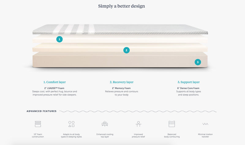
6. Leesa
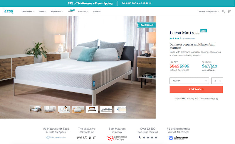
Leesa is a foldable, shippable mattress company that eliminates the need to go to a mattress store. Their branding is crisp and clean, relying heavily on their palette of white, teal, and gray. Many similar mattress companies have popped up, so Leesa cuts right to the chase by highlighting why you should choose them over anyone else:
They also take this opportunity to share their corporate social responsibility policy of donating one mattress for every 10 sold, to make the potential purchaser feel good about their decision to go with Leesa.

A mattress is a big purchase, and so the more you scroll, the more reasons they give you to make the leap. You get a look at the inside workings of the mattress and what makes it unique. Leesa shows product reviews to give you a sense of how much other people have enjoyed it. They even include a FAQ of the top questions asked about their product, so people never need to leave the product page to have them answered.
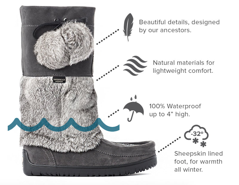
7. Manitobah Mukluks
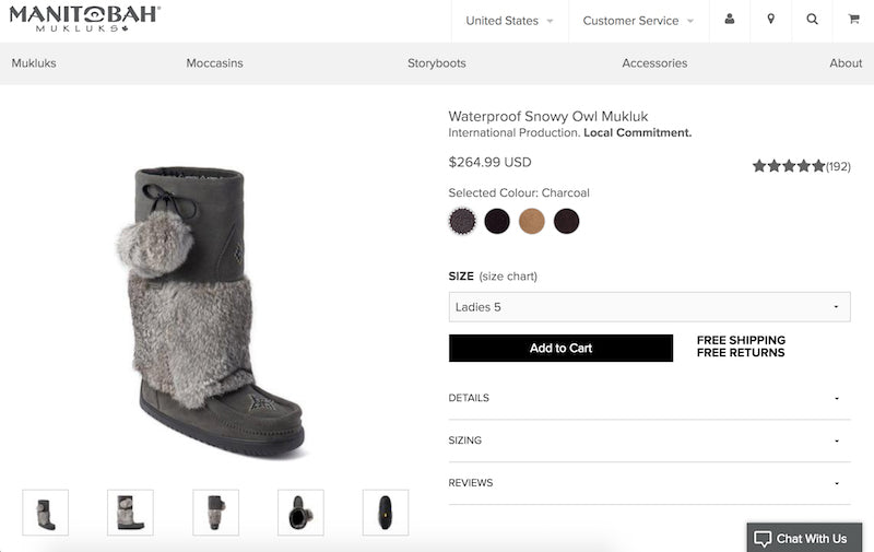
Similar to a mattress, a pair of Manitobah Mukluks has a high(ish) cost per product, meaning that the decision to buy is more complicated. If something costs less than $20 and you feel like buying it, you’re considerably likely to buy it. But the more that price point creeps up, the more guilt you may feel when making a purchasing decision. And guilt is never a feeling you want to inspire in your visitors!
This product page seeks to ease the most common purchasing anxieties: “free shipping” and “free returns” are written in big, bold letters right next to the “Add to Cart” button. People feel like their purchase doesn’t have to be a forever decision, and that the price they see will be pretty close to the final amount.
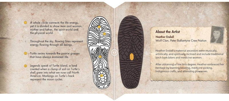
Similar to Leesa, they allow the hesitant purchaser to leisurely learn more about the company and its mission, without ever leaving the product page.
The reader can learn about the company being Indigenous-owned (as well as what that means), and the story behind the art on the sole of their boots. Personally, I think the end of the page should have a second “Add to Cart” button so people don’t need to scroll all the way back to the top if they’ve been convinced on the way down.
8. Perfect Keto
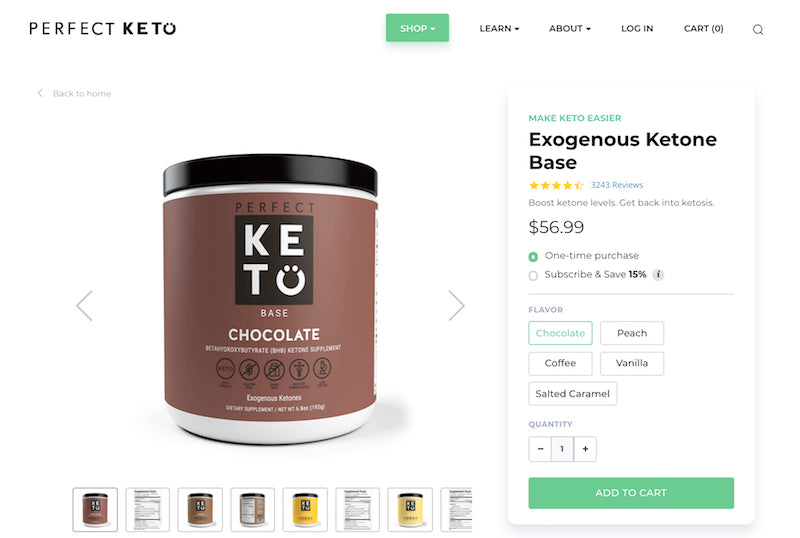
Perhaps I’m biased, having tried an eight-month stint of a ketogenic diet myself, but I particularly like this product page even though it’s relatively plain. It has all the trappings you expect from a high-converting product page, including great product photography, an overview of why you should want to use their product, and the option to “subscribe and save” as a way to upsell by showing people that they’ll save money per product (even though they’ll pay more overall).
This page also employs a “Related Products” section so that even if people aren’t totally sold on the product they’re looking at, they can find similar ones that might be a better fit. Or, as I’m sure is the hope and dream of Perfect Keto, you can just buy the whole lot.
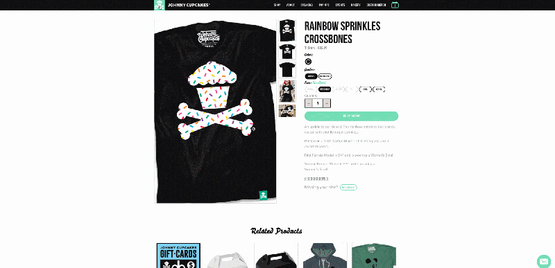
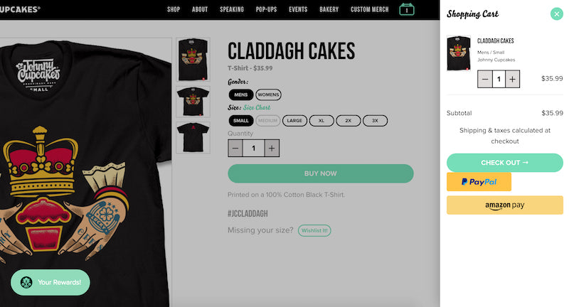
9. Johnny Cupcakes
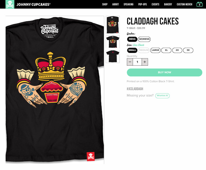
Any product that has to do with or likens itself to sweets is in my good books. Johnny Cupcakes is a playful brand, calling itself “the world’s first t-shirt bakery” and highlighting all their recent additions as being “freshly baked.” It’s a fun theme that works for them.
They make good use of product photography, using high-quality images to show off their clothing and fun designs. And how can you not love their loading animation of a chubby youth chasing an elusive cupcake?
Additionally, when you click the “BUY NOW” button, the shopping cart pops up on the right-hand side of your screen to remind you that you can check out at any time. It’s a not-so-subtle reminder that you have yet to close the deal, and it clearly identifies the ways that you can pay. This effectively turns the product page into the checkout page, which is a powerful way to speed along the purchasing process.
10. WP Standard
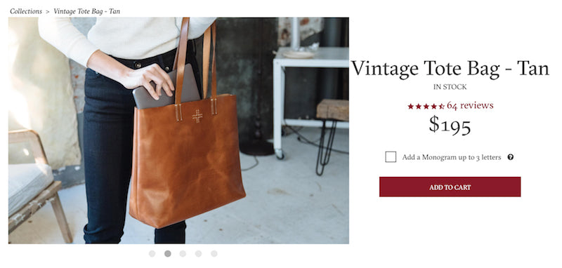
I confess that part of my reason for including this product page is because I have a big, fat crush on this product. It’s so intensely beautiful. What really stands out here is the product photography. It gives you a sense of time and place, so you can really imagine what it would be like to own this product.
A unique element of this product page includes the option to monogram your initials onto the bag. If you’re going to make a financial commitment to a high-quality bag like this, perhaps you want it to truly feel like yours, with the initials to prove it.
11. Master & Dynamic
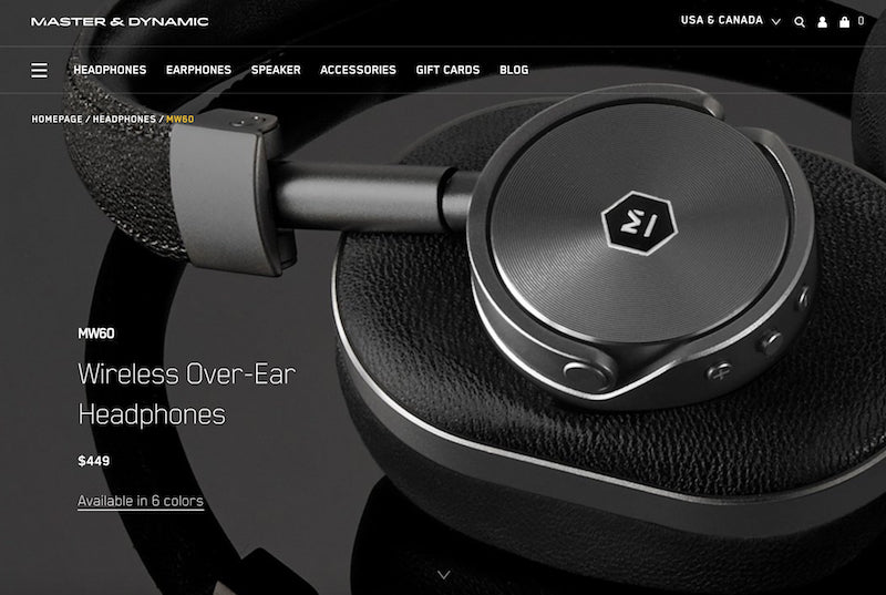
Bold, elegant, and luxe are some of the words that come to mind when I hit the Master & Dynamic website. Close-up shots highlighting the details of the headphones show off the quality and care with which the item was made. It begs you to wonder what they sound like.
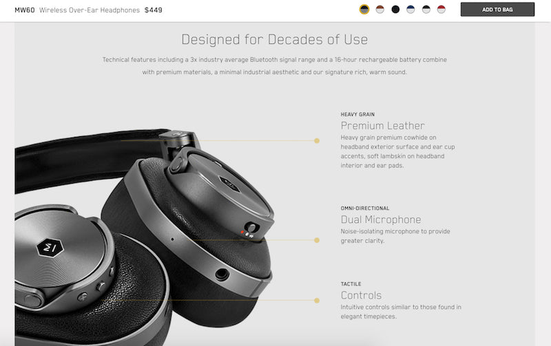
Master & Dynamic’s product pages are almost like experiences themselves. As you scroll, you discover more about the detail-oriented design of the headphones—what they were made of, which advanced features they have, and how to control them.
But they’re not completely prioritizing design over conversion. The floating “add to bag” bar at the top of the page is inconspicuous enough to not distract from the experience, but still a constant remind that you can make these your own. You don’t have to scroll all the way back up and interrupt the experience if you want to buy them. (Not to mention the nice reminder of all the color options you have!)
12. Primal Pit Paste
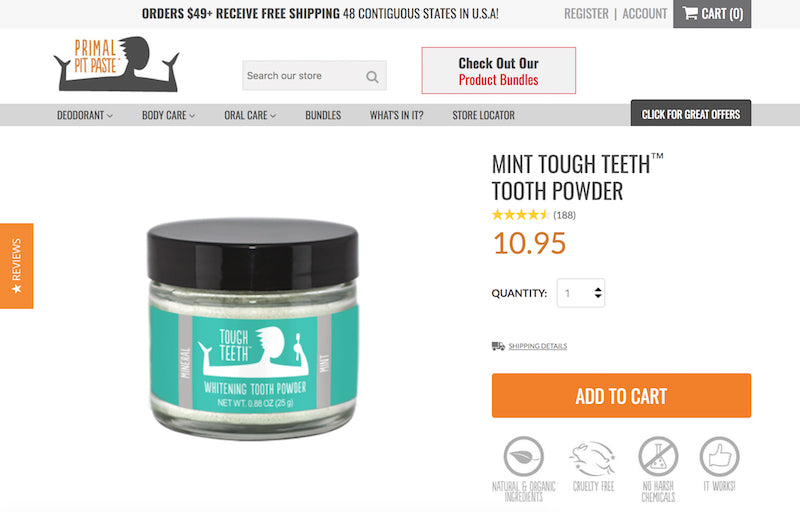
Personal hygiene isn’t the sexiest thing to think about. And for a product that’s associated with being dirty, the product page design is as clean as it gets. An all-white background with touches of bright, punchy color make the brand and products feel fun.
Primal Pit Paste makes great use of customer reviews, highlighting them both next to the price and in an ever-present button on the left-hand side of the page. They also reiterate coveted ingredients and qualities (natural, organic, cruelty-free, etc.) right next to the “Add to Cart” button to combat any buyer hesitation.
Still not convinced? Scroll down the page and get a deeper dive into the ingredients and how to use the non-traditional products. Images and graphics continue the playful element, and you can always pop over to your cart to check out thanks to the floating button on the bottom right.
13. Love Hair
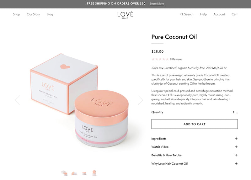
Love Hair is another brand that focuses on clean products, with a matching clean design for their product pages. White backgrounds, grays, and subtle hints of muted color draw the eye to the product images. And they don’t just show you still shots of the product; Love Hair also leverages video content on product pages.
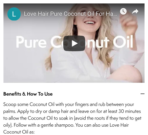
Beneath the video, Love Hair educates users more about the product and what they’ll get out of it, giving them an opportunity to speak directly to their audience’s pain points. And in case you needed any more reasons to buy, “Why Love Hair Coconut Oil” talks more about their quality ingredients and commitment to sustainability.
14. Pilgrim
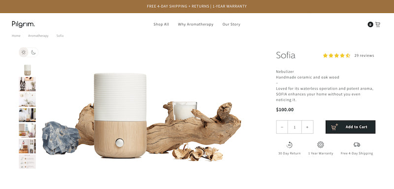
Aromatherapy meets dynamic design on Pilgrim’s website, with product pages that flicker from white to black to give you an idea of what it’s really like to have one of their items in your home.
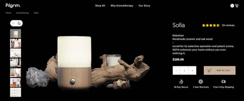
Beyond the flashy effects of their site, the design is elegant and clean as well. The page layout gives a brief nod to some of the standard “why buys”—30-day return, free shipping, 1-year warranty, 5-star customer reviews.
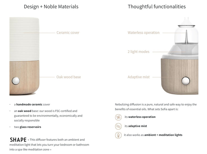
Scroll down, though, and a more robust product discovery experience awaits. Graphics that highlight the features, benefits, and materials of the product, along with user-generated content in the form of videos, give you a deeper dive.
15. Holstee
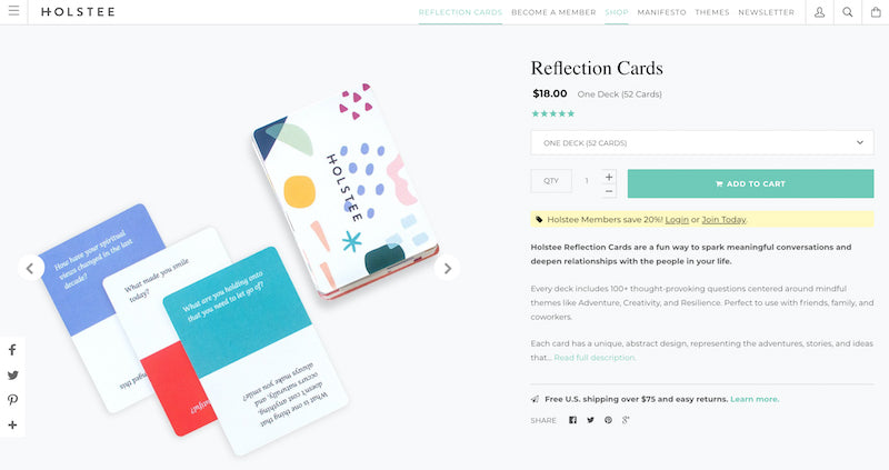
The Holstee brand is fun and playful, much like its product pages. A simple design with splashes of color draw your eyes to a few key elements on the page: the products, the “Add to Cart” button, and the highlighted text—another instance of promoting discounted prices if customers sign up for memberships.
Holstee is a very visual brand, and the rest of their product page isn’t as simple as what you find above the fold. Scroll down and you’ll see more photos, videos, and options to learn more about the product.
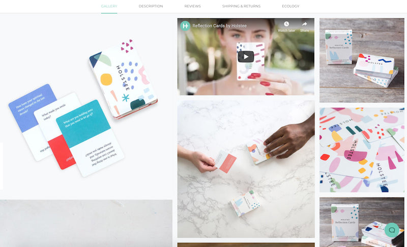
Toggle between more detailed descriptions and specs, customer reviews, shipping and returns, and ecology (which essentially state’s the brand’s mission to great design and quality). This eliminates the need to scroll endlessly to get back to the buy button; instead, users just have to hop back to the section directly above.
Build your product pages with Shopify
You don’t need to be an experienced designer to create product pages that look good and drive sales. With Shopify, you can create product pages that have a balance of both good design and conversion-oriented elements.
Source: Courtney Symons 27/03/2019, https://www.shopify.co.id/blog/product-page